Energy
Digital design and print
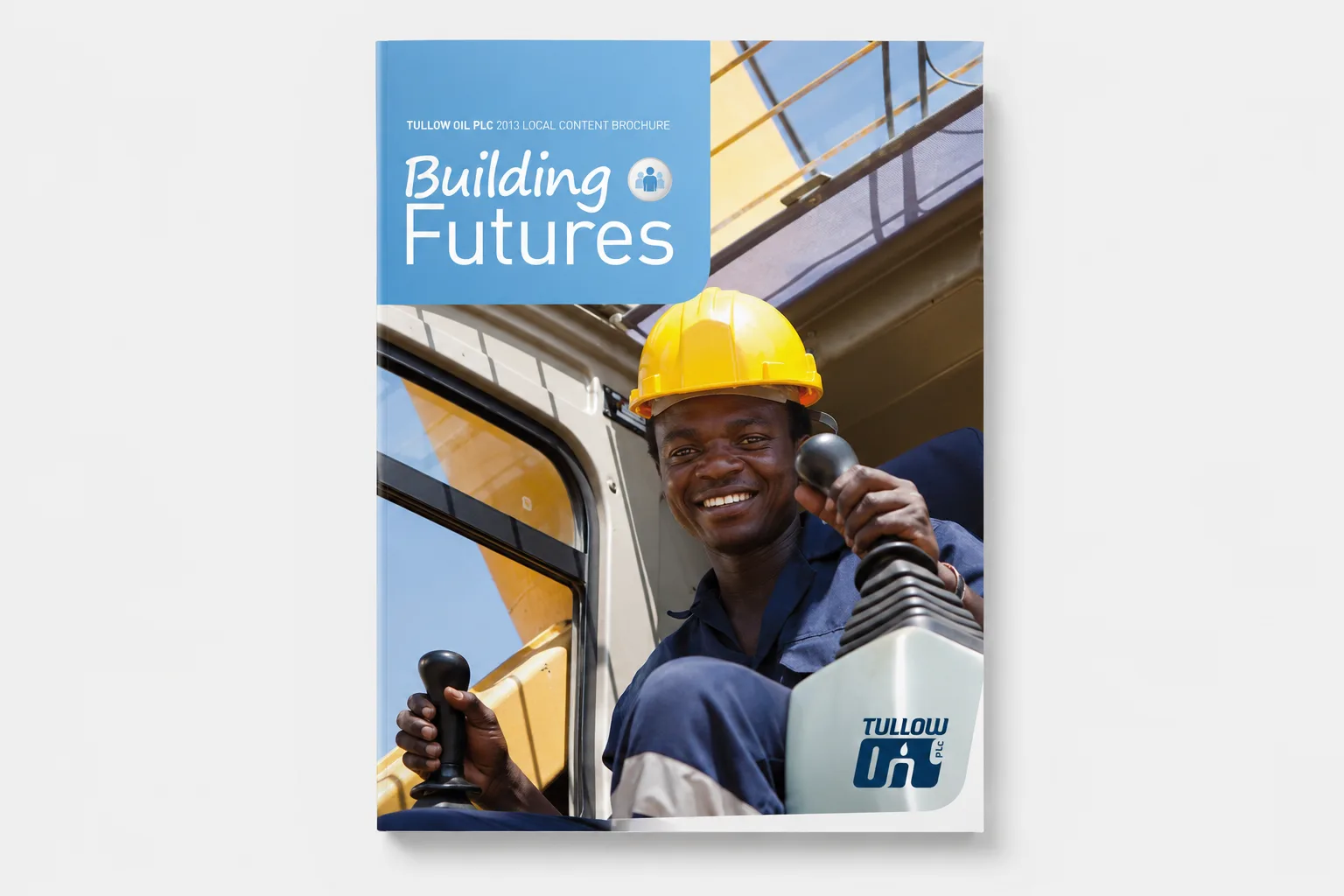
Tullow Oil – Building Futures
Client
Tullow Oil
Sector
Energy
Service
Stakeholder engagement
Format
Digital design and print
Year
2013
Stock
Uncoated recycled
Audience
Communities and local businesses
Award
Gold, WorldMediaFestival 2014
The brief.
When an oil company arrives, most people picture engineers and petrol.
As Tullow weighed development after its 2012 discovery in Kenya’s South Lokichar Basin, the communities nearby had almost no picture of what an operation actually needs, which is caterers, farmers, drivers, security and service businesses long before it needs anyone on a rig. Tullow’s field teams needed something clear and engaging to put in people’s hands at the very first meeting, wherever the company arrived next.
The opportunity.
Don’t explain the industry. Map the opportunity, honestly.
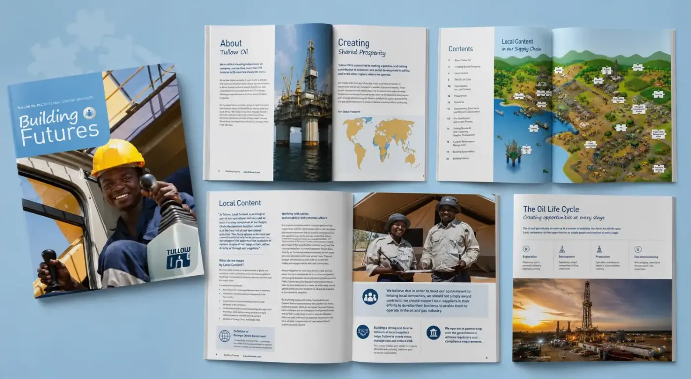
The booklet treats the supply chain as a jigsaw, an idea we developed and ran throughout, with every piece a real place a local business or worker could occupy, from catering and farming to security and vocational training. It made one point on every page: whoever you are, there is a piece with your name on it. And it told the truth about the pieces that don’t exist, stating plainly that production creates few direct jobs and that the real, lasting opportunities sit in the supply chain around the operation.

The work.
A twenty-page booklet built for the field, not the boardroom.
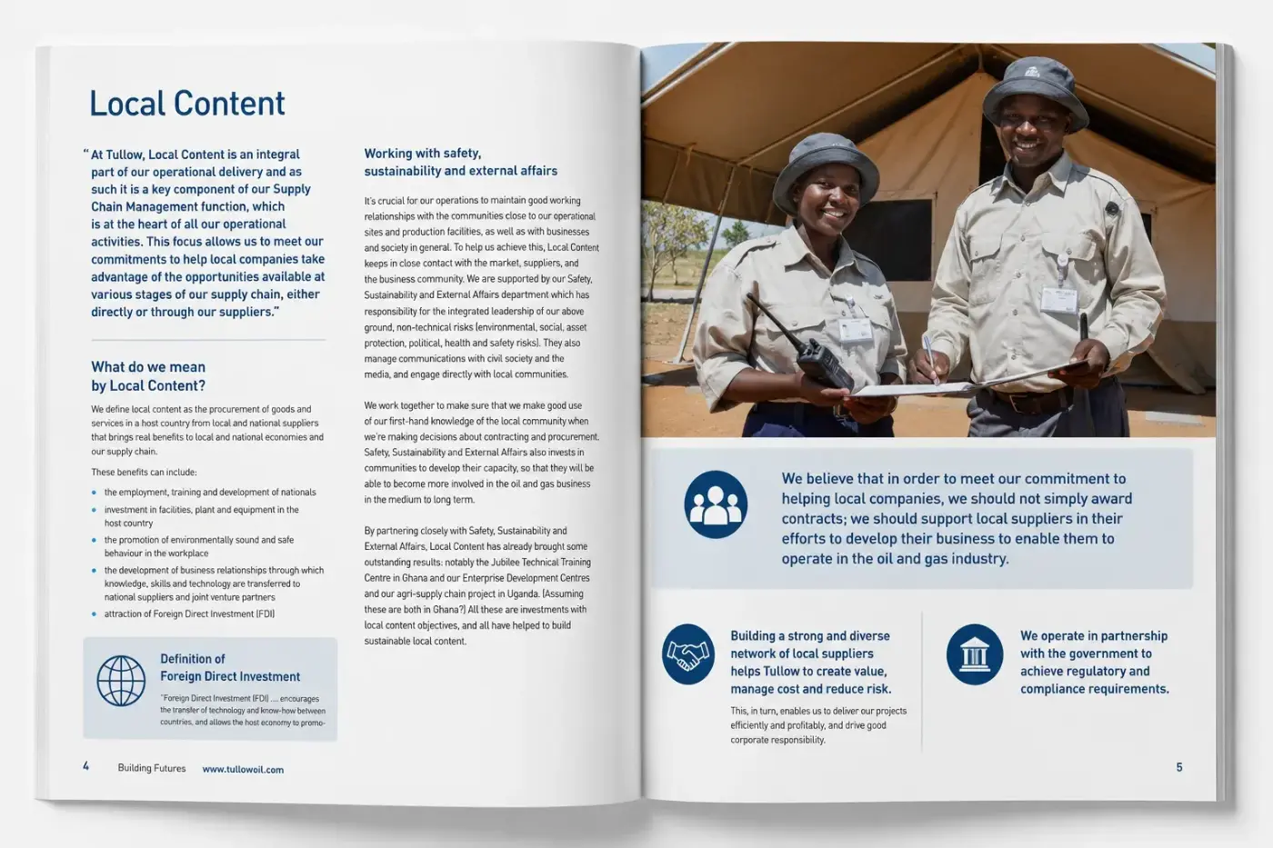
We developed the concept, the jigsaw illustration and the design: a hand-drawn town where every business, from the airstrip to the farm, slots into the operation as a puzzle piece. A life cycle spread walks readers through where opportunity actually sits at each stage, from exploration to restoration. Printed on uncoated recycled stock, it feels plain and understated on purpose, in keeping with what it says. No gloss, no spin.
The impact.
Printed in 2013. Still the reference.
Building Futures gave Tullow’s teams a way to open new-country engagement with something concrete: not a promise, but a map of where people fit. It won Gold in the Corporate Print category at the WorldMediaFestival 2014, and more than a decade on it is still pulled out as the reference for local content communication, its illustration approach reused in work for other operators since.
More like this.
See all work